Connecting for Children & Families
Woonsocket, RI
Connecting for Children & Families (CCF) is an award-winning, community-based, non-profit 501(c) (3) organization dedicated to transforming the lives of Woonsocket children through high-quality educational opportunities and family support.
The project:
Working with the CCF team was really rewarding and what a great cause! I was so fortunate to work alongside the retiring Executive Director, Terry Curtin, who has tirelessly elevated the organization into what it is today. The team was rounded out with their Grant Writer, Director of Communications, and nonprofit consultant, Sarah DeCataldo of Charis, LLC.
Our main objective was to create a website for CCF that allowed the families they serve to be their best. They needed a program directory that highlighted their programs in an easily navigatable way that was sensitive to the main way their clients accessed their site, through mobile devices. Worked with CCF to create a bridge between the copy they needed to provide on the website with taglines, themes, and visual representations to communicate a cohesive brand throughout the website. a consistent branded look that includes the different assets, colors, and fonts previously selected.
This project was challenging, interesting, and gratifying to complete. There were a lot of moving parts, and the collaboration was a great team-based success.
THE WORK
+ Responsive Website Redesign
+ Multi-lingual Website
+ Update Logo & Branding
+ SEO and Accessibility
+ Graphic Design
+ Program Directory
+ DonorPerfect Integration
+ Custom Coding
+ Source & Implement Plugins
+ Create Calls-to-Action
+ Integrate Registration System
+ On-page Navigation
+ Constant Contact Integration
+ Help finding CCF’s online voice
The Before + After
Click either thumbnail to open a static full view PDF of the old site, and the new one when it launched.
Logo Update
OLD LOGO
UPDATED LOGO
CCF’s logo has been the same since it came into existence. They wanted to maintain their identity that’s become so recognizable within the community, but modernize it in slight ways. I updated the font choice, curled the “C” around the family, helping to hold them up, and balanced the logo with the added color. There’s also a play on connecting by having the “for,” the “n“ connected to the “d,” and the “&” connect to the “F” for a subtle tie-in of the brand to the services the organization provides.
Custom Design + Coding
Custom design examples:
Updating the logo to a cleaner, more modern look.
Using the blue, yellow, red, and green color scheme of their logo, I sought to create customized graphics throughout the website. The graphics would guide users in a consistent branded look that spoke to the programs they represent. If you start looking at Summer programs, the visual journey is consistent, so you know you’re in the right place.
Testimonials slider
Employ anchor links to guide users to different sections of an individual page.
Custom coding examples:
Implementation of a multi-lingual website using Google Translate for nonprofits.
Typewriter effect on the home page for their mission statement and Sponsors Section.
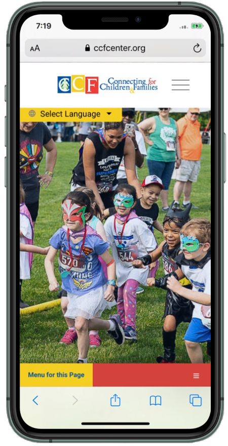
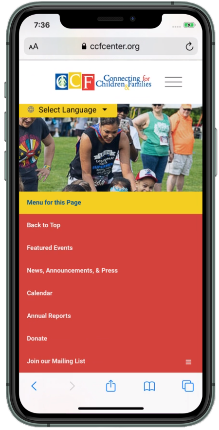
An on-page menu that compliments the main menu, providing a less cluttered approach to navigating pages with a lot of information. Examples can be found throughout the website. This is especially helpful on mobile devices and gives the website a more app-like feel.
A website does get judged by its cover.
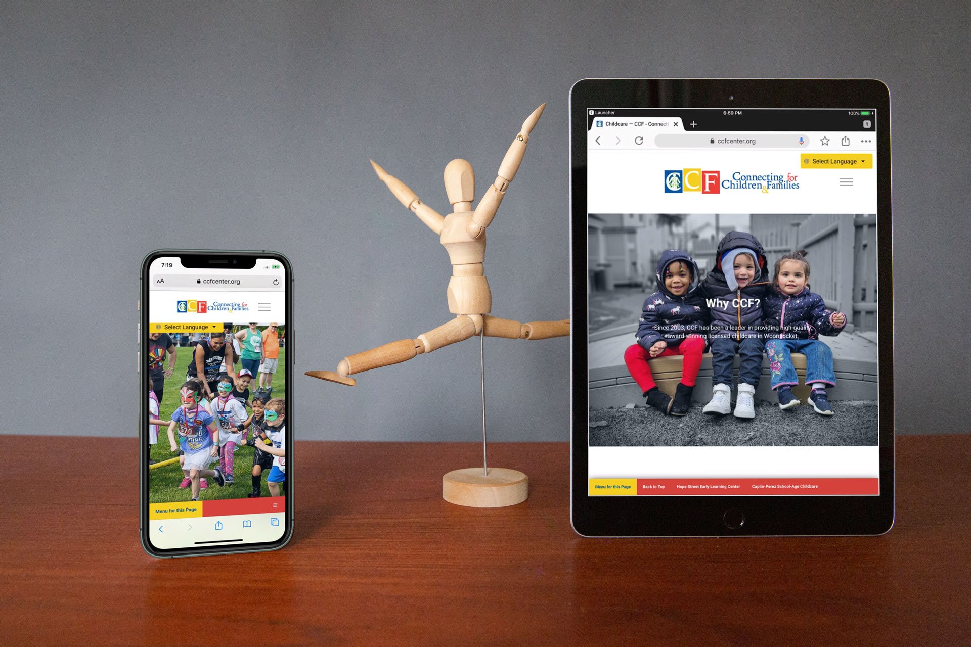
Make sure yours looks good on all devices
Drag and drop web design systems are great for small businesses. Still, most business owners fall into one of two categories: they either quickly get overwhelmed by the learning curve, or they know they don’t have time to focus on anything outside of the services they provide. Those who pick a template they like and get the basics done find that they don’t look the way they want it to when viewed on different screen sizes. Then they get further frustrated after showing their friends and family when a handful all say they see something different for the same page. One sees a word truncated across two lines, another sees it perfectly, another notices that the word goes right off the side of the page. This is where experienced designers can help because they know the ins and outs of responsive design. We know how to write the code to make all the different elements dance into place as the screen size changes between different devices or resizes on your desktop.


