The Conjuring House
Burrillville, RI
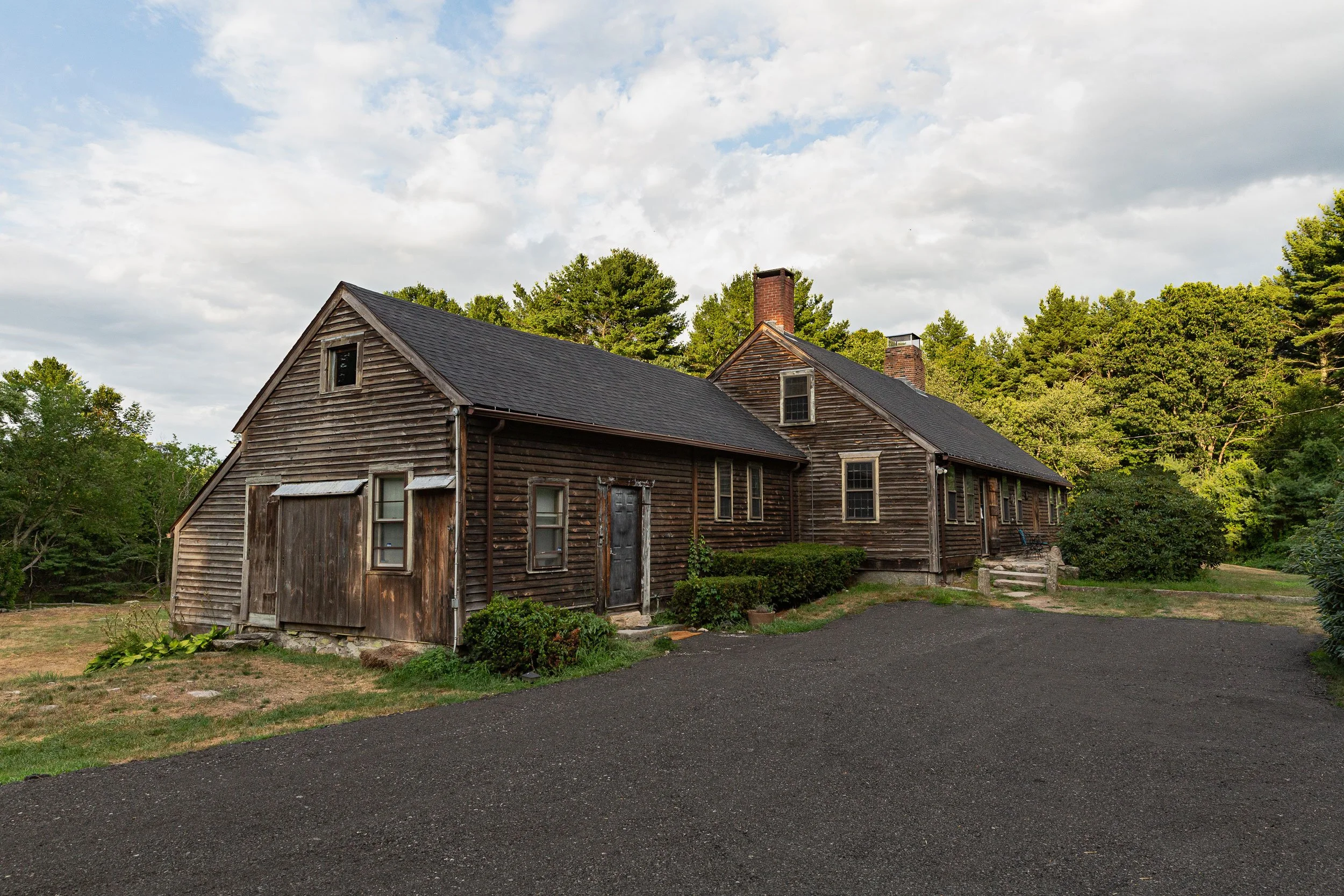
Some things go bump in the night, and The Conjuring House has so many that they made the blockbuster movie, The Conjuring, about the Perron Family’s experience living there. I had the opportunity to rebrand and redesign the website for the real-life house where they give tours and host investigations of the not-so-alive spirits that live there.
THE WORK
+ Logo Design
+ Branding
+ Photography and Videography
+ Video Editing
+ Responsive Website Design
+ SEO - Search Engine Optimization
+ Hospitality Booking Software
+ Newsletter Design
+ Wix Setup
Branding Goals
Colors and feel of the website.
This is just a sampling of where these colors are found in the house. The gold tones can be found on trim, walls, light fixtures, and the dried flowers hanging from the rafters in the kitchen. The silvers and dark greys come from the worn floor boards and the exterior elements of the barn and house.
Logo Design
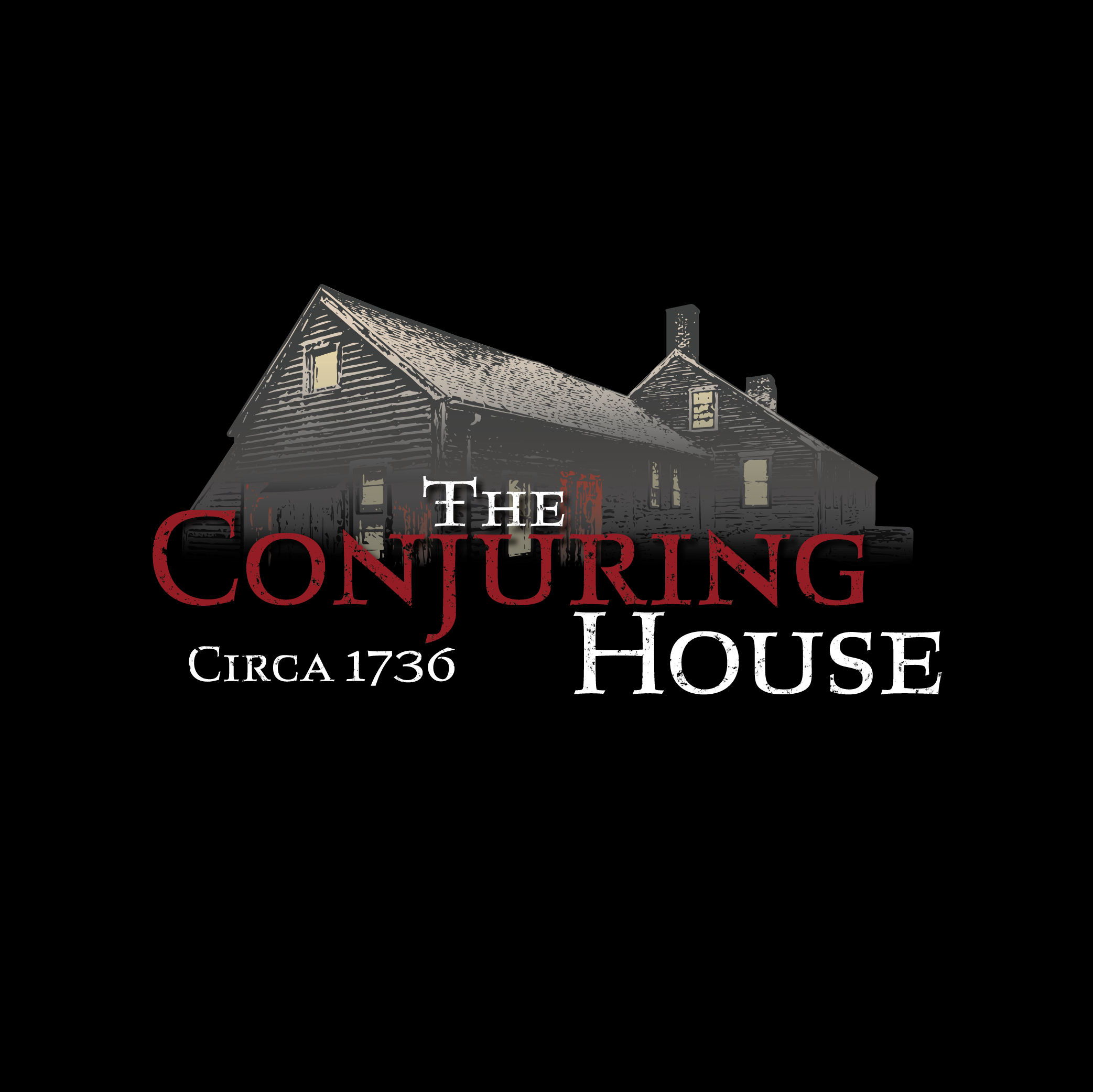
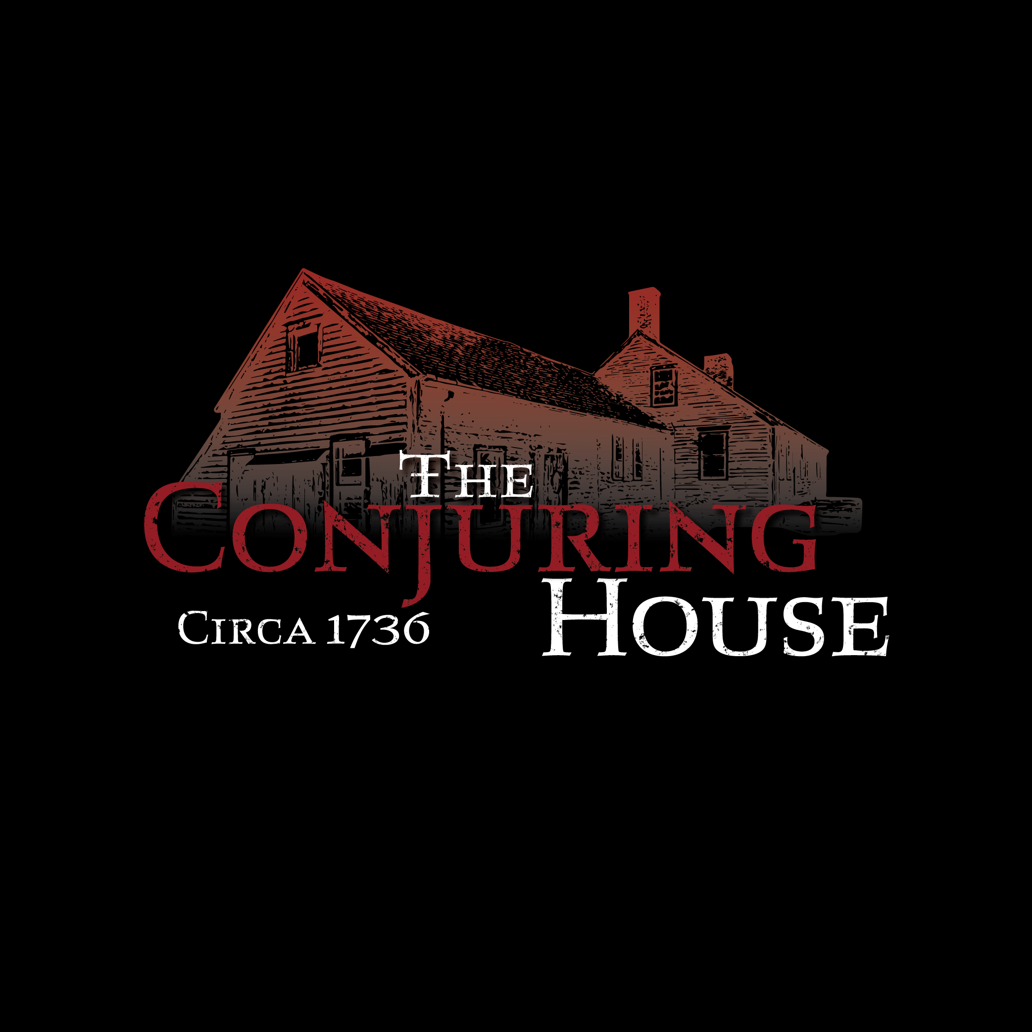
The challenge, don’t copyright infringe on the iconic text-based logo of the movie but make it memorable. Oof, no pressure. I got to work in the first place that made sense, looking at fonts from the time period the house was built, the 1700s. Next, I wanted to use a photo I took of the house and create a graphic. In the version Jacqueline chose, I was looking to illicit a ghostly house. What better way to accomplish that than to have half of it disappear? Simple yet effective.
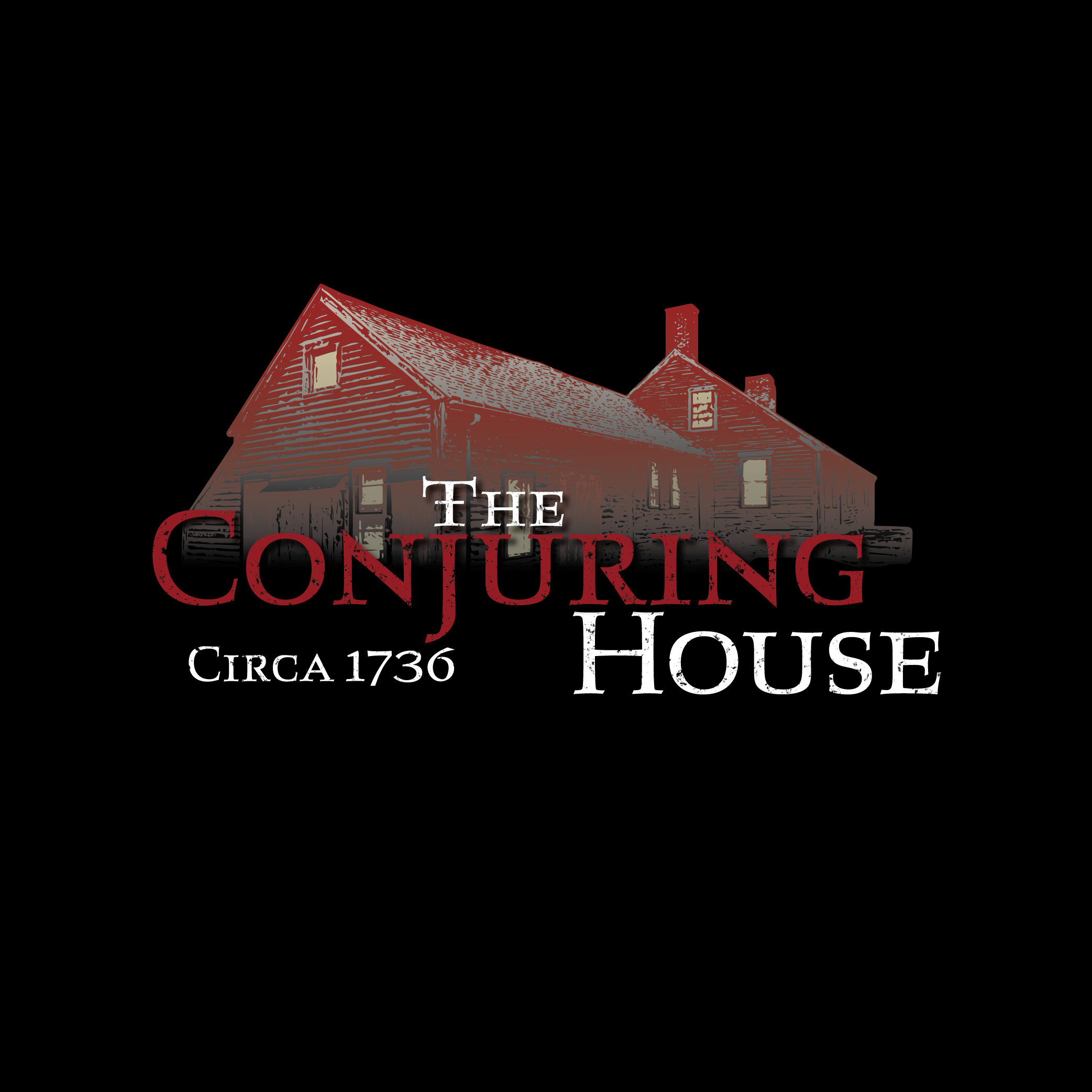
Below are the additional versions of the logo which serve different purposes throughout the year on social media.
Website Goals
Don’t scare people; intrigue them.
Build a new responsive website on the Wix platform to replace the old site and incorporate the new branding.
Find new booking software to replace the old website’s booking system, which was clunky and outdated.
Facilitate the integration of the third-party booking software FareHarbor onto the website.
Add movement and interest in the Experiences sold with a video montage welcome banner on the home page.
Use photography and videography throughout to engage users, but not scare them out of booking with The Conjuring House.
Create a newsletter template for the announcement of special events.
Sell Gift Cards through the booking software.
Home Page - Desktop Version
Home Page - Mobile Version
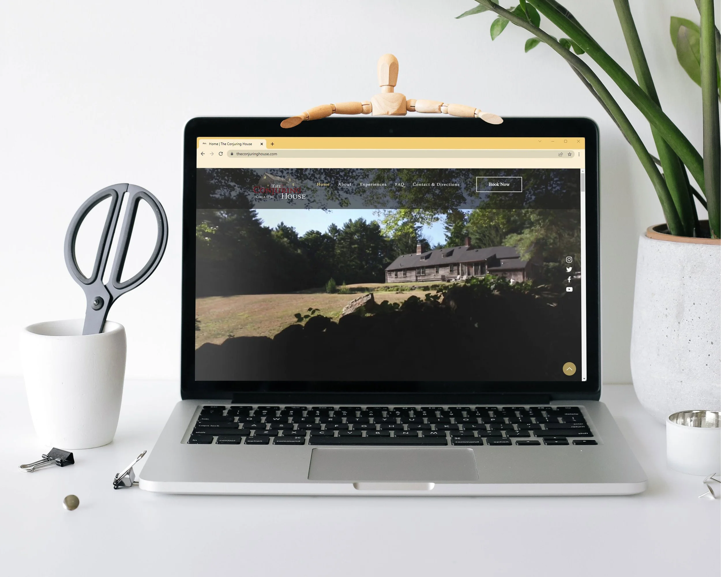
You can click the corresponding image to view the full page of either the desktop or mobile version of the website on the day we launched.
THE WEBSITE IS OWNER-OPERATED.
Videography + Photography
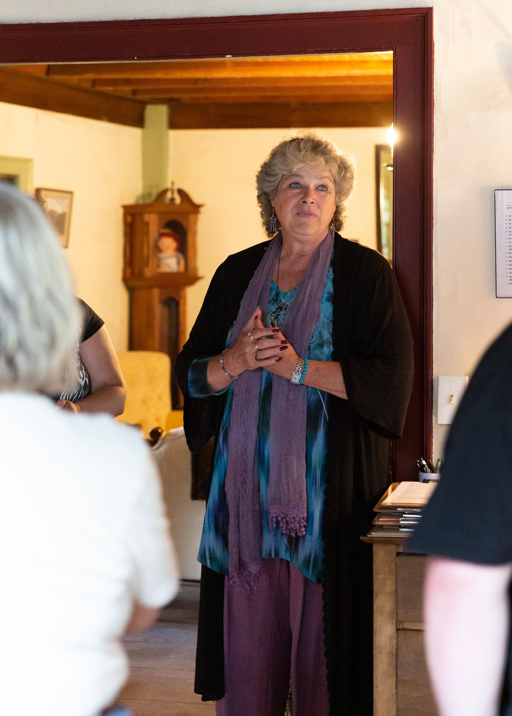
I spent five days, including one overnight in a yurt-style tent on the property. I'm fine to admit it; I was nervous to spend the night inside! During my time there, I photographed and filmed clips from several events to give a sneak peek into different experiences on the property. I tried to give it that handheld lurking feel.
Clytie Sadler, LLC owns the copyright for the following:
Videography
Home Page - Welcome Banner Video
GHO-Roam Event Banner Video Clip
Gallery Event - Welcome Banner Video Clip
GHO-All Night Event Banner Video Clip
Photography
You can click on a photograph to view the full-sized images.
